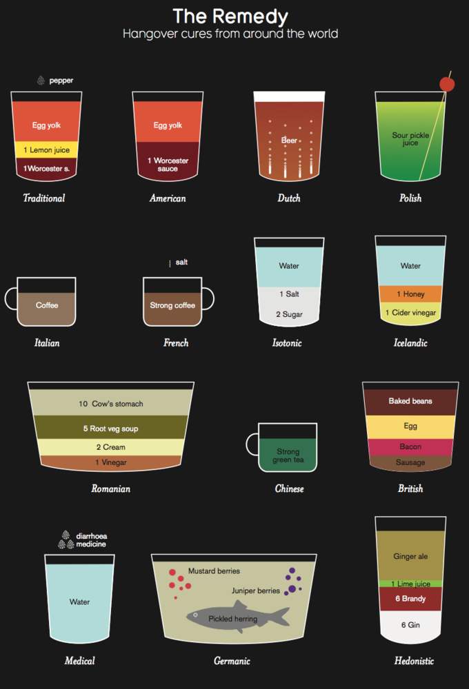
Ever wonder why you’re more attracted to people after a few drinks? Have a look at the following infographic and learn why.

Source: http://visual.ly/

Giving you the knowledge to buy better beer.
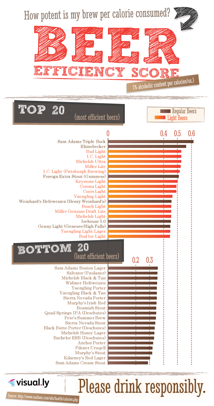
We recently shared an infographic that detailed the calories in various drinks, but how do the calories line up with the ABV? Check below for a list of beers that give the most ABV bang for their caloric buck.

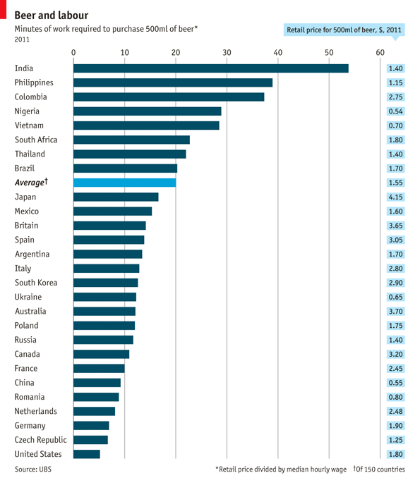
We all work hard for our money, but how long does it take the average person to save enough money for one beer? In the United States it takes about 5 minutes to save the average amount (although I think $1.80 is a little low unless this is retail, not bar prices). India seems to take the longest at almost an hour.
ON SEPTEMBER 22nd, the beer started flowing at Oktoberfest in Munich, an annual Bavarian beer festival which confusingly begins at the end of September. Last year, over the course of the 16-day event, visitors glugged 7.5m litres of beer, sold at an average princely price of €9 ($12.50) a litre, which is what a typical large stein holds. Germans love beer and down around 100 litres per person a year. Away from the Oktoberfest beer is readily affordable. Analysts at UBS, a Swiss bank, have calculated that it takes a German earning the national median wage just under seven minutes of work to purchase half a litre of beer at a retail outlet. At the bottom of the pint glass, low wages and high taxes mean that boozers in India must toil for nearly an hour before they have earned enough to quench their thirst.

Source: http://www.economist.com/


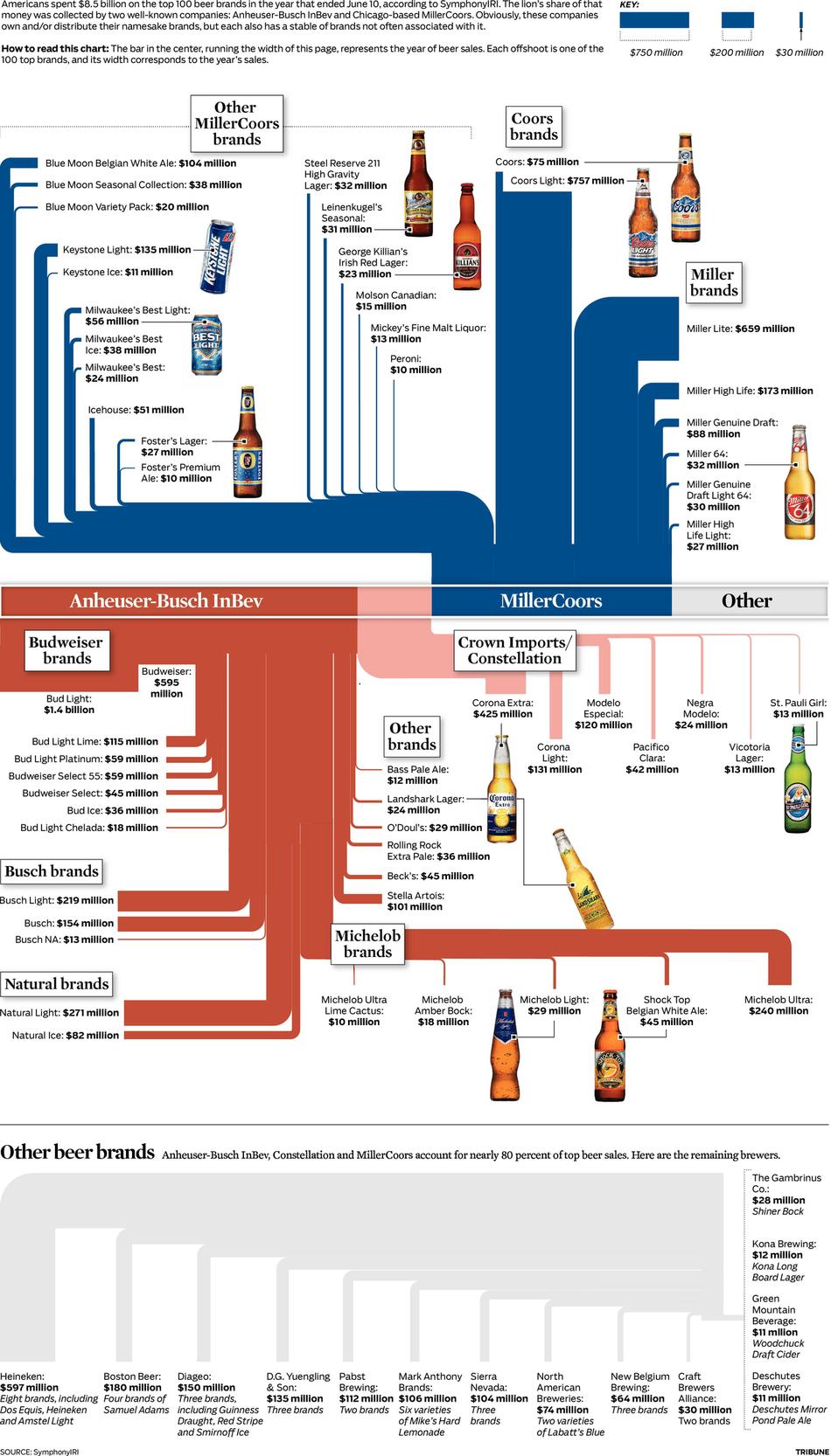
You know that here at Indy Beers we love to promote the little guy. Well, we also like to let you know the monopoly the big guys have in the market.
Last week’s announcement that Anheuser-Busch InBev had agreed to buy Corona maker Grupo Modelo is the latest move in a long trend of consolidation in the beer market, leaving it increasingly about two giant players — AB InBev and Chicago-based MillerCoors.
The folks over at www.chicagotribune.com put together a great graphic showing who owns what, so check it out below and see who owns what beers.

Source: http://www.chicagotribune.com/
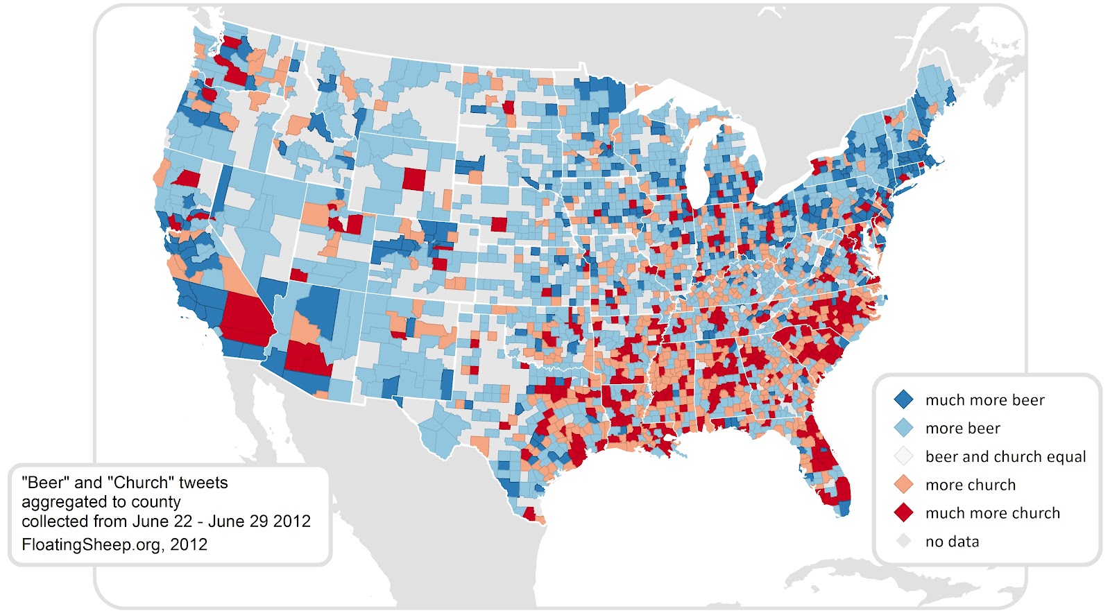
The folks over at www.floatingsheep.org put together a nice little Infographic on the difference between tweeting about beer or tweeting about church. The sample data set was from June 22, 2012 through June 29, 2012 and looked for either the word “Beer” or “Church” in a tweet. They found a total of 17,686 tweet mentioning “church” (half of which were sent on a Sunday) and 14,405 tweets mentioning “beer”.
The data was reviewed further to break down the numbers by state. Below is the breakdown on a per county basis of the tweets.

They also created another graphic that clearly shows a north South divide in the country between these two keywords.
Given the cultural content of the “church” tweets, the clustering of relatively more “church” than “beer” content in the southeast relative to the north-east suggests that this could be a good way to identify the contours of regional difference. In order to quantify these splits, we ran a Moran’s I test for spatial auto-correlation which proved to be highly significant as well. Without going into too much detail, this test shows which counties with high numbers of church tweets are surrounded by counties with similar patterns (marked in red) and which counties with many beer tweets are surrounded by like-tweeting counties (marked in blue). Intriguingly there is a clear regional (largely north-south split) in tweeting topics which highlights the enduring nature of local cultural practices even when using the latest technologies for communication.

I’m not sure what this means, but in Maryland, we seem to be right in the middle, and that’s fine with me.
Source: http://www.floatingsheep.org/


Follow Us!